The psychology of design explained
Article courtesy of: http://www.digitalartsonline.co.uk/
Anna Richardson Taylor explores the importance of an understanding of psychology when it comes to design
What does the World Wide Fund for Nature’s logo have in common with a jar of Waitrose Honey? They both use a stylised image of an animal, and are examples of simple yet effective design. They are also both neat practical applications of the psychological theories of Gestalt.
Developed by German psychologists in the 1920s, Gestalt theories explain how people tend to organise visual elements into groups, and how the whole is often greater than its parts. Their application takes advantage of how the brain self-organises information in a manner that’s orderly, regular, symmetrical and simple. Used in a logo, the Gestalt principles make it more interesting, more visually arresting – and therefore themessage more memorable.
Whether this only vaguely rings a distant bell of your design education, Gestalt and other psychological hypotheses – such as colour theory or semiotics – are still very much in evidence in today’s creative industries.

Branding agency Turner Duckworth often plays with the core tenets of Gestalt, having created the design that appears on jars of Waitrose’s own-brand honey, for example. It uses implied shape in three ways: to indicate Waitrose’s ‘E’, as well as the shape of a bee and a honey dipper.
Its recent design for a limited edition Coca-Cola’s Summer drinks can also uses this tool, creating the shape of a Coke bottle out of the negative space between two flip-flops – forging the association between summer and the soft drink.

The WWF logo (designed by Landor) uses the law of closure, its visual elements suggesting a connection between each other, even though they don’t completely touch.
Semiotics, the understanding of signs and how they convey meaning, is evident in most smartphone app logos, for example. Whether through icons (clear representations of the object itself, such as the camera), indexes (signs that have a connection with the object but are not real representations) or symbols that have no visual connection, the logos help users know their function through connecting their meaning to existing associations.
Theory test
So does the application of psychological theories make design more effective? And does being a good shrink make you a better designer? Many creatives will remember the core principles of Gestalt, balance, and the golden ratio and the rule of thirds from design school, but should they be applied to make a better design?
Ed Woodcock, director of strategy at branding agency Aesop, believes that designers might not always be aware of using psychological principles. “It does happen that someone takes psychological theory and applies it to creativity in some way, but it’s more likely that someone creative intuits what’s a truthful way of perceiving and sensing things. And that’s then reflected in their work and gets picked up by psychologists,” he explains.


For a recent campaign for beer brand Birra Moretti, Aesop designed a series of press adverts that featured an archive image of a women looking directly at the viewer. The image and composition were chosen instinctively by the designers, says Ed, but they still use the psychological effect of the direct gaze that makes the viewer more responsive.
However, today’s use of psychology in design needs to go beyond those basic theories learnt at college, believes Andy Budd, founding partner and managing director at digital design consultancy Clearleft. Understanding of cognitive behaviour, for instance, can hugely affect a design, and tools such as Stephen P Anderson’s Get Mental Notes card deck can help designers apply psychology to the creative process.
“To be a good designer in today’s society, you need to have an understanding of psychology, human behaviour, and the little shortcuts, the little quirks, in the way people operate,” he says. “Then you can use them to make it easier for people to engage with your products.”
Great design requires great psychology, agrees Simon Norris, managing director at Nomensa, a design consultancy that combines psychological insight with design. “Psychology is the science of behaviour and the mind. When design and behaviour match, the design will be superior,” he explains.
Books such as Richard H Thaler and Cass R Sunstein’s Nudge have brought the strand of behavioural economics to the mainstream in recent years, and its principles are particularly relevant in creating digital user experiences for example.
“It’s about trying to remove barriers of friction and trying to nudge people in a direction that’s ultimately going to be best for them,” explains Andy. There are a number of cognitive biases that are “psychological shortcuts that humans make to basically avoid thinking”, he adds.
Social proof is one such bias. It purports that people are more likely to do something if others are doing it too, and is used by Amazon to great effect. The company’s product pages are crammed full of items of social proof, such as reviews, recommendations and top 10 lists.
Meanwhile, the latest Audi poster campaign, ‘Everything You Need, Nothing You Don’t’, arguably uses cognitive dissonance to draw your attention. Making the script marginally more difficult to read engages the brain more effectively, and therefore allows you to process the message more easily.
Behavioural therapy

Paul Davies, who was a psychologist before becoming a designer, runs psychology-led design consultancy Behaviour, also believes that an understanding of behaviour can make design more effective. “Psychology has a huge impact,” he argues. “Unlike artists, designers have to make something for effect; an artist can start a project without a brief, but a designer has to have a purpose and they have to do that for a particular audience.”
Paul believes this is becoming particularly important as design gets increasingly used to effect positive behavioural changes. For a recent project for breast cancer charity CoppaFeel, Behaviour was asked to design a tool for young women to get into the habit of regularly checking for early signs of breast cancer.
It worked with psychologists at University College London to build behavioural insight into the design of an app to help its users stay engaged, and ultimately build long-term habits. For example, when people first start the app they are encouraged to read out a pledge – “research shows that consciously acknowledging a commitment leads to a stronger chance of long-term engagement,” Paul explains.
Users also see how many other people have ‘copped a feel’. This feature exploits the fact that people are more likely to participate in an action when they see others doing the same. These and many other insights are built into the app to encourage young women to form a habit.

“It’s this insight into the way we humans work that design needs to connect with more,” Paul adds. “A great-looking design isn’t always a great working design and often design without psychology is a source of dangerously misapplied effort.”
Another area of psychology that’s of growing relevance is neuroaesthetics. This deals with the effect of art and imagery on a neurological level, and how subtle differences in colour, contrast or grading, for example, can affect the emotional reaction to – or the quality of – a piece of design.
James Digby-Jones, partner at Saddington Baynes, is a keen student of image theory and the emotional effects of varying aesthetics. He has been manipulating, tweaking and improving images for quite some years. “Essentially, we’re about the use of colour and the retouch styling to affect a viewer’s response to an image,” explains James.
“It’s very much about mood and how you feel about an image. We create additional engagement with imagery – through the choice of colours and the tonality in addition to the colours themselves, the relationship of how you separate or identify different elements within the image – how you help lead the way the viewer is going to perceive the piece, and so on.”

 Emotional engagement is the name of the game, he adds, and eliciting or heightening emotional reactions through various adjustments to an image is the company’s bread and butter.
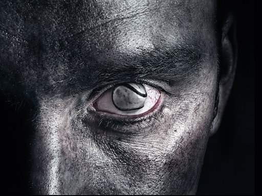
The aim of recent Guinness ad in Ireland, It’s Alive Inside, which featured an Irish hurling ball as a man’s eye, was to shock and unsettle the viewer. The impact of the original image of an eye staring out was further enhanced to highlight the “unflinching biological reality of the eyeball”. Subtle touches, such as giving the hurling ball a wet translucency and adding a tinge of pink to the inner eyelid, helped to make the viewer feel challenged and unnerved. In addition, the balance of tone and palette of the colour grading needed to reflect the brand’s previous campaigns.
Saddington Baynes’ expertise goes beyond the stipulations of colour theory, and James is not advocating the adherence to a set formula of psychological theories – by definition that would be anti-creativity. But an awareness of psychology can inform good design in very tangible ways.
Time to start swotting up on those psychological theories. In fact, Paul wants psychology research to become more widely available to the creative industries. Citing a student who trotted out the hackneyed description of a designer as “an artist who can’t draw”, Paul counters: “Designers are actually psychologists who can draw.”


Leave a Reply
Want to join the discussion?Feel free to contribute!